TROMjaro XFCE Alpha
by Tio
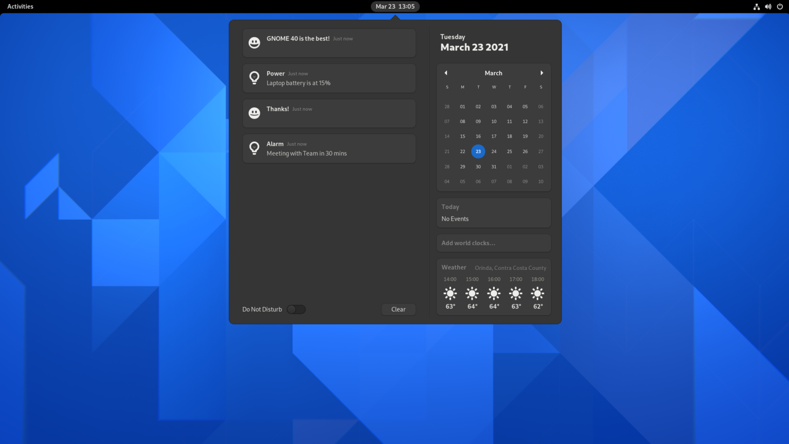
These past days we’ve played a lot with a new desktop environment for our TROMjaro distro. Why? Because we rely on Gnome for the current TROMjaro and that is a pain in the ass from many perspectives. For one, customizing Gnome feels like hacking Gnome, and this slows down the desktop and breaks it at times so badly that you cannot boot into your system anymore. Gnome, by default, is a very weird desktop environment. Looks like this:

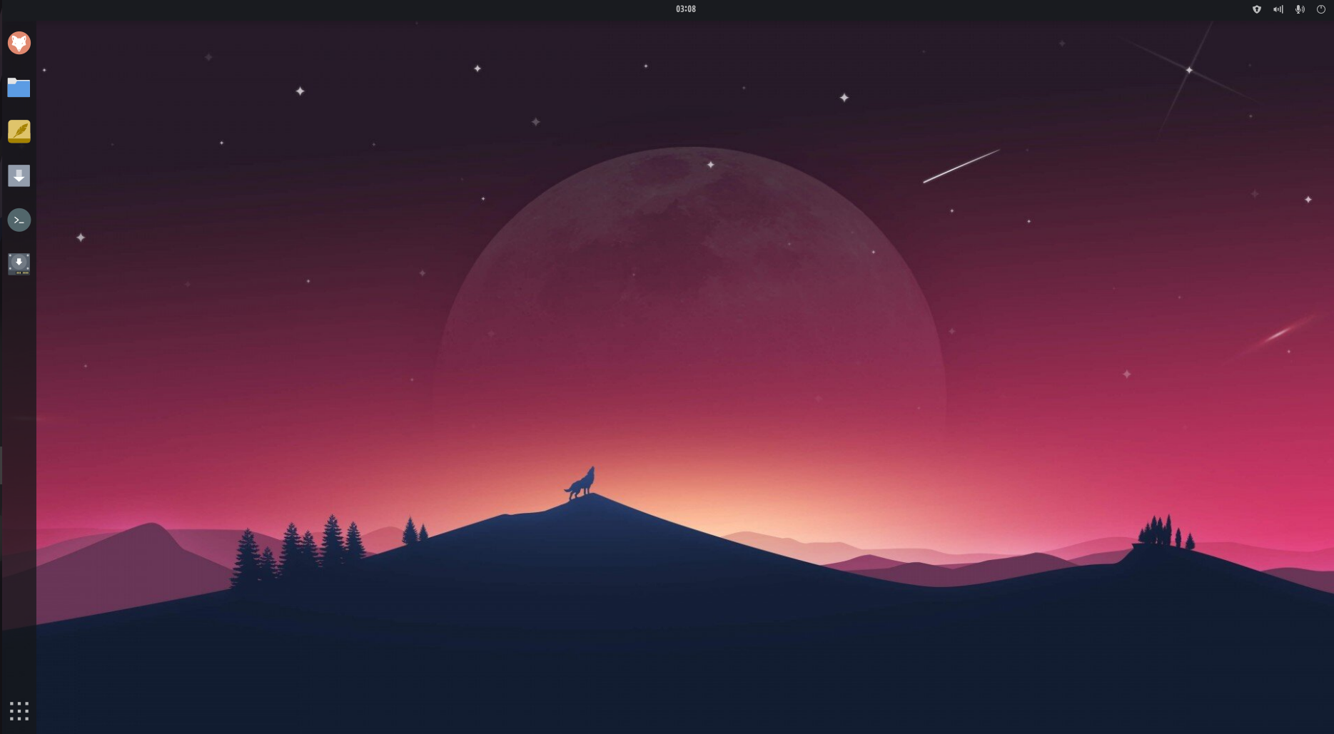
Where are the apps? windows? what are activities? …. You have to know how to use your keyboard to do anything with Gnome. You can open 50 windows and then go back to the desktop and have no idea where any is… So pretty much everyone who uses Gnome for their distros is going to add some sane things to it, such as a menu with apps, such as tray icons on the top right…. And so we also did it:

For that I had to install a few Gnome extensions. And the Gnome team is very much great at pushing updates that will break many of such extensions. Lately they announced that future Gnome versions will make it a LOT harder for others to customize the look of it. And it was already hard to do it.
So Gnome is hard to customize and because you will have to add a bunch of extensions then you’ll make it slower and prone to bugs, some really nasty.
To give you two examples:
- One time they updated Gnome to a new version and one single extension that we were using to provide the tray icons (which are quite essential), broke the entire desktop so badly that I had to teach some users to “hack” into their system and remove that extension.
- If I do a single simple change, like adding a new default app on the left taskbar for TROMjaro, for the ISO that we release, I have to export the dconf (Gnome settings) into a plain text file, then search through that file for that line where I have added the app to the menu (that would be the setting for the Dash to Panel extension we use for the left sidebar), then add it to a package we created to overwrite the changes in Gnome, build the package locally, add it to our repo, update the repository database, and sync it to my system. Now build the new ISO. NUTS!
Don’t get me wrong, I very much like Gnome overall in terms of design if you add a few extensions to make it usable. Looks very modern and is easy to use. With a few extensions we made our TROMjaro look quite well I’d say. We tested it a lot. But maybe is time to move to something new and fast and reliable.
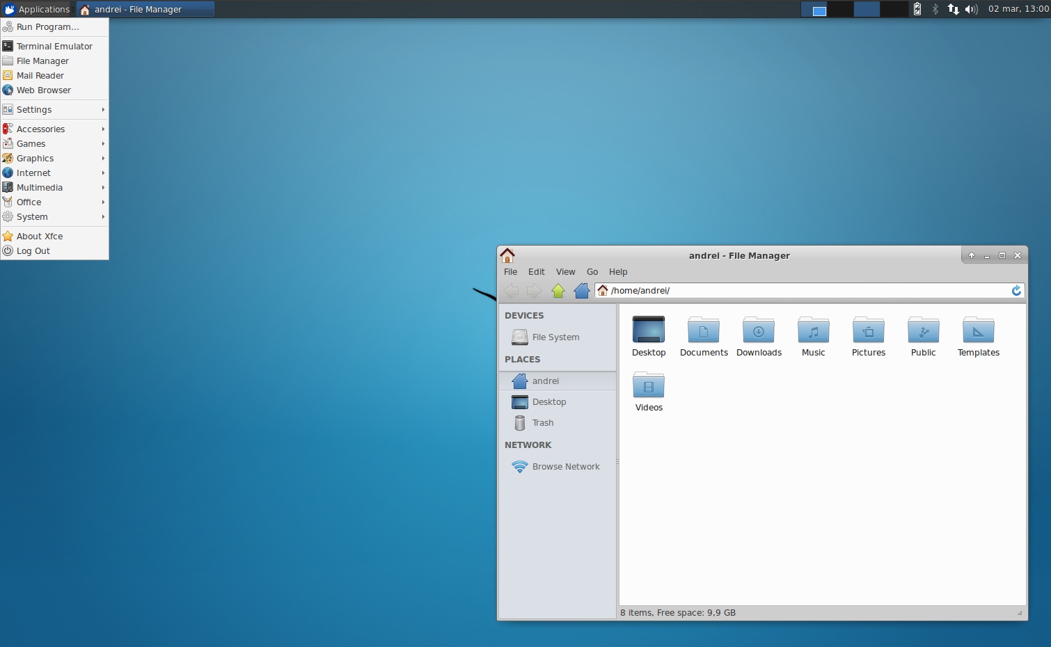
Here comes XFCE. Look how not nice it looks like:

Design is subjective, I wrote books about it, but the default look of XFCE looks very 1995. For that reason I, honestly, ignored it for a while. Thankfully a few TROM-friends insisted that I should try it. I was thinking at first to make a TROMjaro version for very old computers, using XFCE. But then….I managed to make it like this:

Panels are many, customizable, and native:
This looks very similar to our Gnome version. And it was so easy to do it. Plus, I had to install only a few XFCE plugins that feel quite native to the desktop. I won’t even consider those as “extras”. Remember how difficult it was for me to port the changes for Gnome? In XFCE I do these changes in a Virtual Machine then basically copy a folder with all of these changes to my build directory, and then build the ISO. That’s all. 50 times easier. And these panels that you see are part of XFCE and you can move them anywhere you want, plus add as many as you want. Basically the changes I made are quite native changes to the XFCE desktop.
You can add elements to the panel and sort them as you wish. Plus each of them has a sane amount of settings. Nothing crazy, but enough to let you customize them.
The apps menu is simple and fast:
The desktop itself feels so much faster and does not feel like I hacked it to make it the way it is. And here are more of the cool features, in short.
The apps menu is much faster. The Gnome one looked more modern, and we can for sure make a similar one with some other packages installed, but the “default” one is really great and you can customize it quite a bit. You cannot drag and drop apps into folders, but you can add them easily to your favorites or edit the menu and sort them via that tool. Not as easy as Gnome, is true. But being so fast makes is to much more efficient to use.
Workspaces are more functional but not as "cool":
The workspaces are not as sleek as on Gnome, but they seem a lot more functional and faster to use. I may improve this but so far so good. You can switch workspaces via the top: 1,2 buttons, via scrolling on the desktop, or move the mouse to the right of the screen to see all workspaces and move the windows between them. I would love if this last option would support window preview, and if there was a sort of animation when switching between workspaces so it makes is obvious when you switch. And of course, you can add as many workspaces as you want.
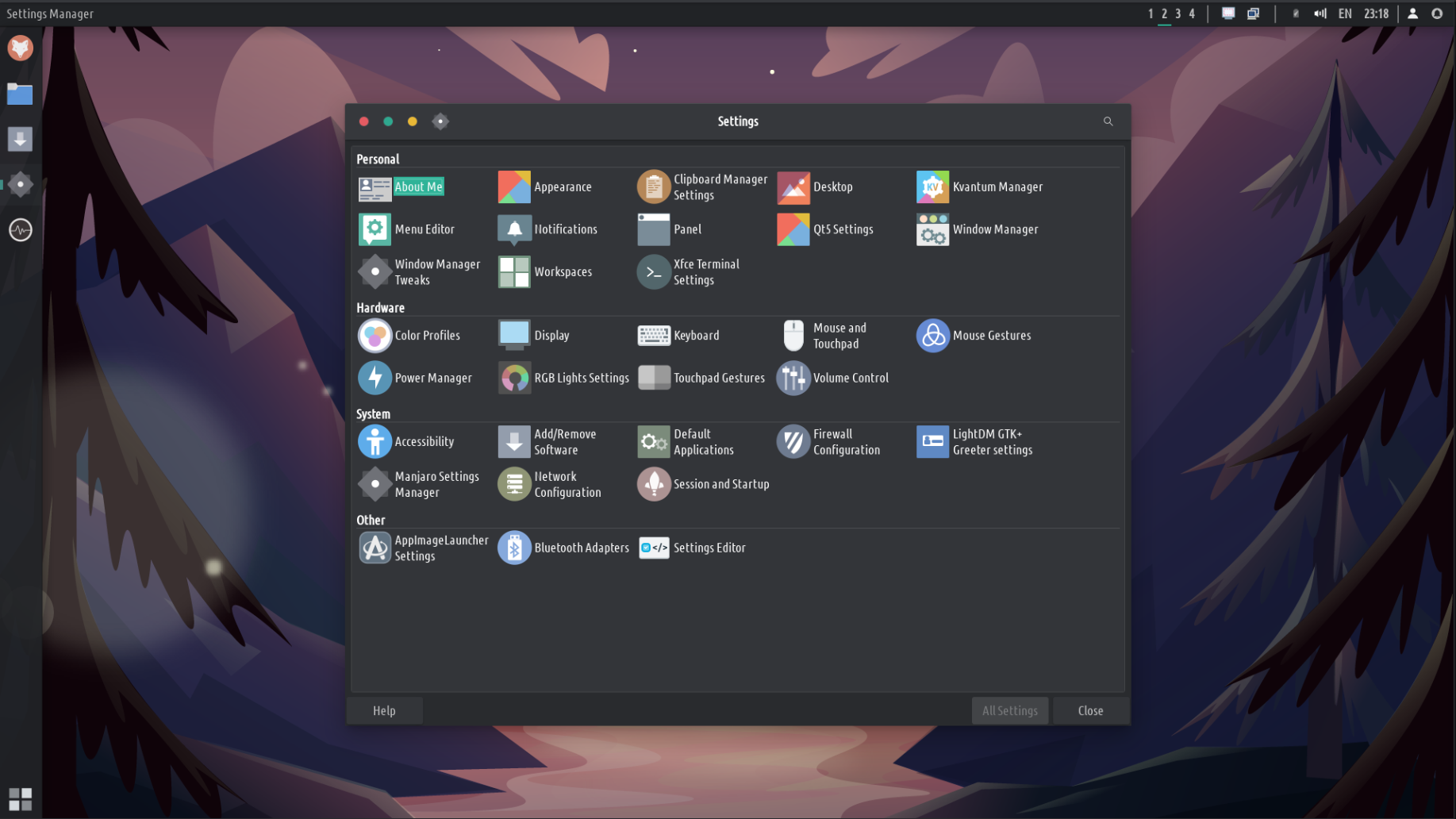
The settings are many, but not overwhelming:
In Gnome the settings were a bit more compact and simple to navigate. But XFCE does a good job too. Also, don’t forger that in Gnome you had to install 2 more apps (Extensions and Tweaks) in order to change the theme, icons, manage extensions, and more such basic functions. XFCE does all that by default via their Settings Manager, although it looks a bit more oldish. But, again, very functional!
Global menus! Finally!
I love global menus and it makes the desktop look more “united”. Apps’ menu should not stay in your way, when you watch a video, edit a photo, write a document, and so forth. So porting them to the top menu bar is amazingly great. As a bonus in XFCE you can hide the top bar of maximized apps so it saves some spaces on top. To restore pres SHIFT (or Control depending on the version of the ISO you try) and drag the window back. Also, you can minimize some applications to their top bar by using the mouse scroll wheel while hovering the top bar. A coll little thing.
HUD. I am in love!
There is one extraordinarily useful tool in Linux that pretty much no one appreciates: HUD. Or the ability to quickly search through menus and select an option. This is so useful I can’t describe it. Imagine you edit an image and you want to quickly edit the “levels”. How you do it? Click through menus to find it and apply. But with HUD you press ALT on the keyboard and type the first few letters and select it. It is a massive difference. Here:
You may think that I am either stupid and didn’t know where the “levels” option is, or I pretended to not know. Honestly I thought it is in Filters. And I used GIMP for years now but I always forget where so many options are. With HUD I found it in a second or less. You can’t tell me HUD is not amazingly useful!
I will try to theme it to blend to the desktop but for now both the global menus and HUD are very easy to setup and install and feel very natural, not a hack.
I tried to bring back the global menus and HUD to Gnome for years….and I tried so many packages and tips and tricks. Only a few worked and worked very awfully. Just awful…unable to use them. And I tried so much.
There are other advantages and some disadvantages to XFCE over Gnome. For example there are a few Gnome apps that can only be installed if you also install the Gnome desktop or many Gnome packages, and that will probably break XFCE. These are core Gnome apps like the calendar, contacts, and such. So we will have to find replacements for them.
Anyway, this is what I can tell you now. We will have to test it for weeks/months before making it the default TROMjaro. And we need your input. You can download the ISO from Ebe a. Use our TROMjaro support Matrix channel “#tromjaro:matrix.trom.tf” and give us some feedback. We really need it!
Our plan would be to eventually release 2 TROMjaro XFCE: one that replicates the current TROMjaro setup, and one that looks/feels the same but will be very minimal with very few, if any, apps installed.
What would happen to TROMjaro Gnome? Do not panic. It will keep on working and we will always provide support for that. We may even release new ISOs with Gnome. For now the TROMjaro Gnome is still the main TROMjaro. The XFCE needs a lot of testing: are the keyboards working? touchpads, touchscreens, multiple displays, is it stable? And so on.
I have been looking at other desktop environments such as Deepin, Plasma, Budgie, Mate, and the like. I find XFCE to be simple enough that it probably is very stable from one update to another; it has enough options to customize your desktop in so many different ways from the get-go, without the need to install more than 3-4 XFCE plugins; and is dealing just with the desktop, no “software center” and the like. Any app that worked on TROMjaro Gnome will work on TROMjaro XFCE. The way you install, remove, or keep your system updated will be almost 100% the same.
Ok, you can access TROMjaro XFCE via the button bellow (we may release new ISOs so check this from time to time).
UPDATE: To Aplha 2 !!!!!!
We have an Alpha 2 release! And we have made it much better. I will try to list the improvements/changes here.
A different wallpaper for every workspace!
Because XFCE lacks any animation when switching to a different workspace, Alexio had the brilliant idea of adding a different wallpaper on each workspace, so that you can easily tell them apart. But the way we did it is quite cool, since we use the same flat wallpaper for 3 workspaces, with different timezones (morning, afternoon, and night). Just a little nice touch. And we set it up for 7-9 workspaces, with difference scenery. Here’s how nice it looks like:
Top bar, better now!
The right side buttons (tray icons) are better organized now. The notifications are persistent so they won’t disappear unless you dismiss them from the notifications menu + we added a user icon that allows you to shut down, suspend, reboot, and such. Plus we added a brightness button to tweak your screen brightness, and a button to change the language of your keyboard. Keeping it useful! On the left side we managed to properly integrate it with the global menus and now whenever you maximize a window you have no more window top bar, allowing you to take full advantage of your screen. The window buttons and global menu are now all on the top bar, as it should be!
Save your sessions!
Another super cool thing about XFCE is that you can save your sessions. Say you work on a lot of things, and have so many applications opened. Now you want to restart for some reasons or switch users, but when you come back you’d like all of your applications and such to be opened the same way it was before the restart/user switch. Well now you can, and this is amazingly cool. Although is not 100% perfect, it is amazingly useful.
We sorted the menus and apps to make them a lot more useful.
For one, we’ve added to the main Settings Manager more settings, so now you have all them into 1 single place. This is something I could have never dreamed of doing in Gnome. I managed to add things like Opene RGB, Easystroke, Touche and the like, 3rd party applications that allow you to control your RGB lights on your devices, add gestures to your mouse or touchpad. In other words, I was able to improve the array of settings users have access to.

On top of this I was able to reorganize all of the other apps and rename them, so that they are easier to find. Instead of NewsFlash you have RSS Reader, instead of Cheese you have Webcam, and so forth. It is a LOT saner this way. Actually the awesome XFCE and the menu we use, lets you use the generic names, wherever they are setup, globally. With a click of a button. But I didn’t want to set this up for all of them since, at times, can be confusing if you are searching for a specific app, say Element Messenger, and all you can find is Messenger. Now is easier to find what you are looking for! Plus, we default the Super key to the app-finder instead of the bottom left menu. Both are quite the same, but the app-finder opens up in the center of the screen and is much faster to quickly search and find an app this way. On top of this I was able to edit these apps individually and add keywords to them, so that it is easier to find them.
This is how you can edit the applications in TROMjaro XFCE. Not as intuitive and easy as sorting them in Gnome, but you are able to not only sort them, you are able to rename them, change their icons, add keywords and so much more.
There are a few other changes/improvements under the hood. But the most notable one is the way we setup the default system backups. Before, in TROMjaro Gnome, anytime you would update an app, even a single one, the system will create a FULL system backup that could have taken 10 to 30 minutes to finish at time. Right now the system will only do a backup if core system packages are updated, not a single app. More to this, we test BTRF as a system partition tool and that seems to be thousands of times faster when it comes to backups. Like it takes a few seconds to create a backup. And you can even access these backups from the GRUB. Meaning that if you cannot boot into your system anymore, reboot and press SHIFT and you then see a menu and restore your system from there. We have to adapt our GRUB theme for this as right now you can’t see that option. Plus we have to test these new backups a lot more.
In a Virtual Machine the system feels a TON faster than Gnome. It is pretty, fast, useful, and has a few unique features I’d say. Next thing is to test it on physical machines, and that will be our Beta release after we test it like that. For now, feel free to grab this Aplha 2 release from down bellow.
UPDATE: Alpha 3, fixing some stuff
I got the change to test it on a laptop for the first time, and it did not go well. Tried for like 2 hours. Then I realized I missed some stuff from the build. So I fixed it eventually. Meaning that the previous ISOs were not able to install the system, only to test it in a live environment. Sorry about that, but is the process of testing. So we fixed that and a few other things. There are some bugs like the wallpapers do not respect the workspaces we setup, it only showcases the first wallpaper. Plus we have to improve the way we deal with workspaces because currently the right side preview may become annoying.
I also tested the BTRF and timeshift snapshots and the great part is that they work very fast. Blazing fast. To backup and restore. However I could not restore form GRUB although you can see the options in our custom GRUB too. I don’t know why but could not restore from there.
Now I will have to basically wait and see how well it works on that laptop + I will try to install it on my tablet to test it on a touchscreen too. But first I’d like to add more touch and mouse gestures as default. So far, XFCE rocks!
UPDATE: Beta is out!
Read the article Ebe a, and grab it, play with it, give us feedback!
Ihe yiri ya:
enweghị ngwa emetụtara.


Hello…i really like Tromjaro! Keep good working! One question: Every Alpha Iso, i neede reinstall the system?
Since this is an Alpha release for testing only then in order to test a new release yes, you have to install a new Alpha. Soon we will release a Beta and beta can be updated since it will eventually be used as the main one.